The aesthetics, the visual identity, of a product have always captivated the heart of a consumer and pushed them to buy said product. Depending on the colors, shapes, intensity, size, design, packaging, the act of purchasing can be initiated more easily: it is the “silent seller”!
A large number of producers have understood this, particularly in the world of wines and spirits. Just think of an average consumer who goes to a wine section of any supermarket… There are so many options: how do you choose? “Hey, this bottle is very pretty, I’ll buy it even if I don’t know the producer, the region, the grape variety, the production method… No matter, it will look good on the table during the meal!” . 7 times out of 10, a consumer makes a decision in the aisle when faced with products and this decision-making lasts on average 30 seconds, not to mention that when we go shopping, we see 250 product references per minute!! You must therefore be effective to differentiate yourself, to stand out and to get noticed!
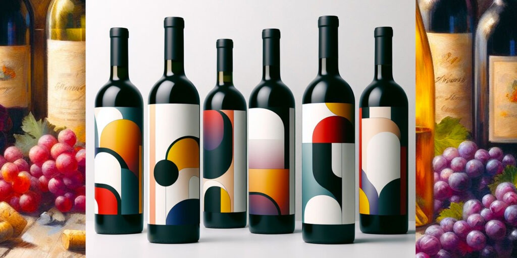
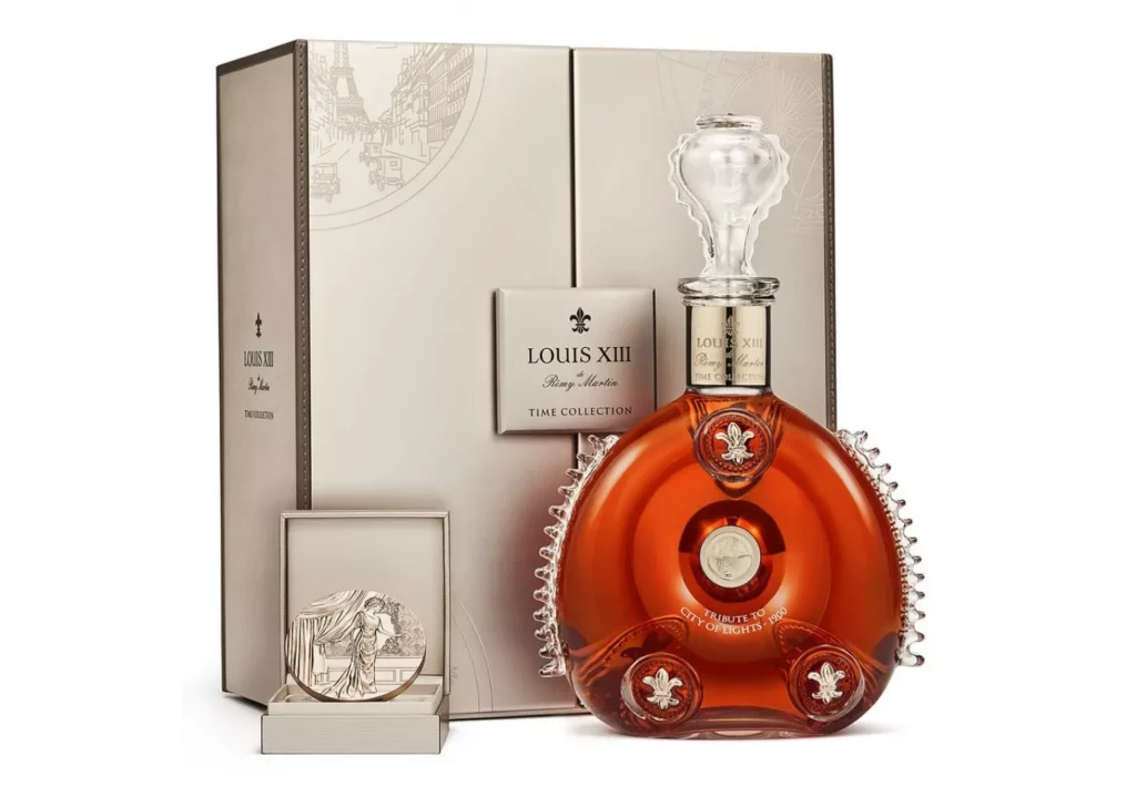
This is how we see the development of colorful and often gendered packaging: pink for girls, blue for boys (no comment…). We can admire flamboyant labels with textures and gilding. But we also see exceptional packaging, particularly in spirits with bottles that are like perfumes. The famous Louis XIII by Rémy Martin is a work of art and those in the know who can afford it generally keep the empty bottle carefully. It must be said that the container costs almost as much as the contents!
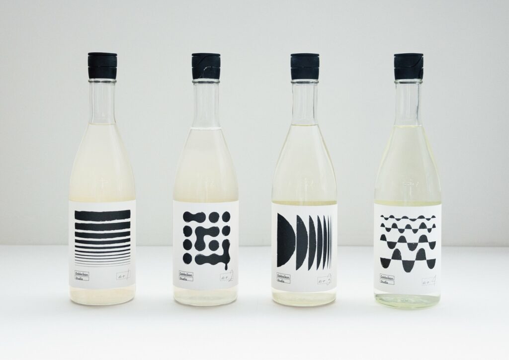
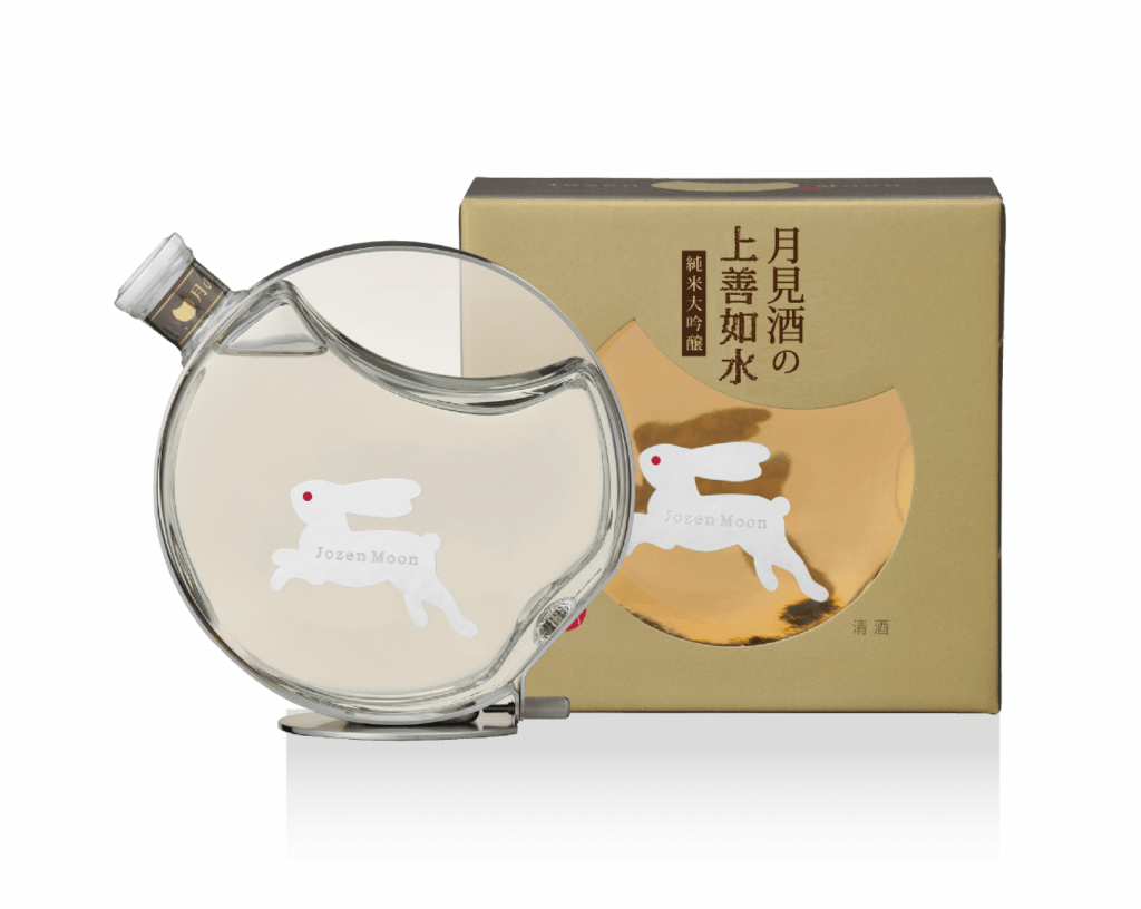
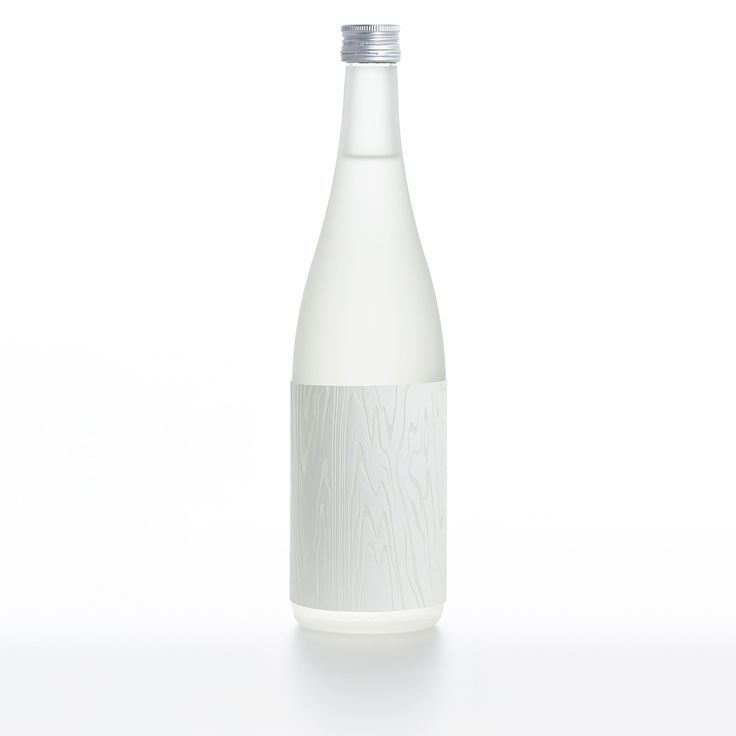
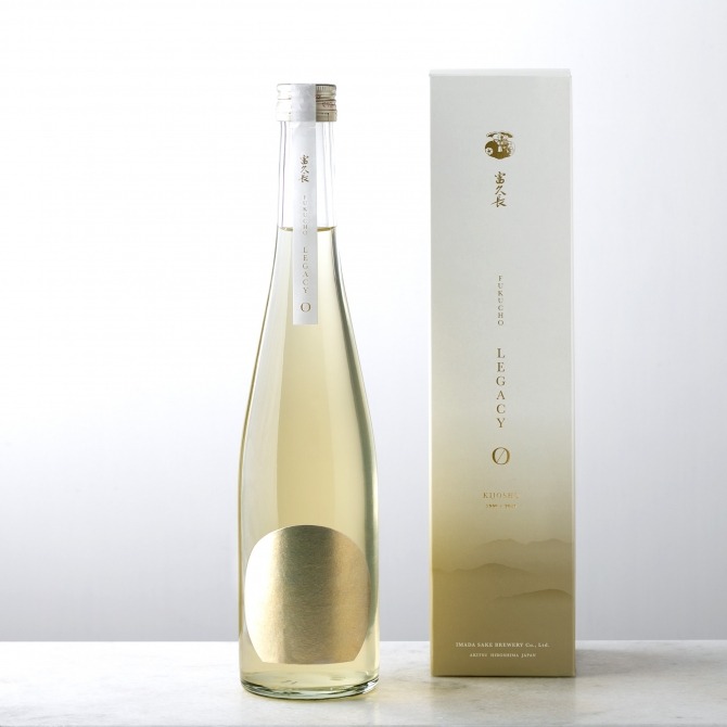
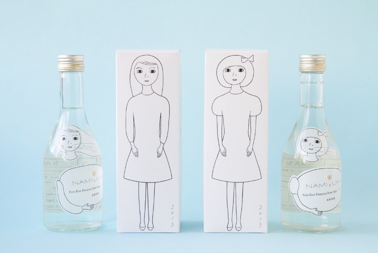
In Japanese sake, it’s the same and we cannot say that the bottles are banal… They are not always easy to understand (even for the Japanese) with very stylized ideograms sometimes… However, that the labels are magnificent with great attention to detail without forgetting that the bottles themselves can also be very designer. In this article, I wanted to talk about more modern design: traditional labels will be the subject of a future article and even a future KOME podcast.
Didn’t you know that I launched a podcast called KOME ? You can find it on all good platforms like Ausha, Apple Podcast or even Spotify and on Paul Bert radio where the podcast is a show! There is one episode per month around the 15th… Subscribe to the first French podcast around sake, Japanese alcohols and Japanese culinary culture
Here are some bottles that stood out to me!
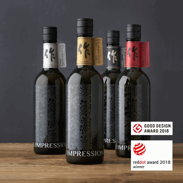
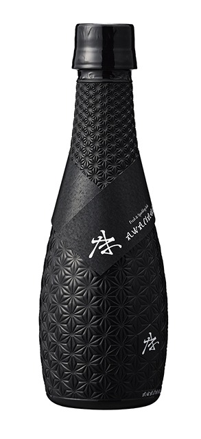
The first is Zaku Impression from Shimizu Seizaburo House which is located in Mie, Japan. The range features limited edition sakes. Without labels, the bottles are engraved using a method classified as intangible property since 1952: the ise-katagami method. This incredible method involves taking “washi” rice papers and dipping them in a fermented persimmon juice called kakishibu. This gives a brown color to the leaves and then the latter, which are more solid, are cut, finely, like lace. The patterns made will be used as a stencil to make kimonos. I was captivated by the beauty of this bottle and I enjoy having one at home to look at all the little details! It’s this bottle that I talk about specifically in my France Bleu Gironde column: you have the link at the bottom of the article to listen to me again or you can check my Instagram (@chloeandwines) to see the reels.
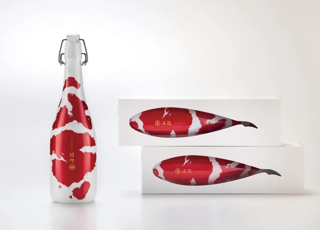
Then there is Koi of the House Imayo Tsukasa with its Koi carp design. Aya Kodama, graphic designer and designer, was in charge of creating this bottle and above all adapting it to its packaging for a stunning Wow effect! It is in fact a slight snub to a method practiced during the Second World War (and even after): ‘kingyo-shu’, goldfish sake. Because of rationing, it was customary to add water (or alcohol) in sake The sake was then so diluted that it was considered that a goldfish could have survived without problem in the drink… Maison Imago Tsukasa never used this. practical. The bottle has won several awards in design competitions.
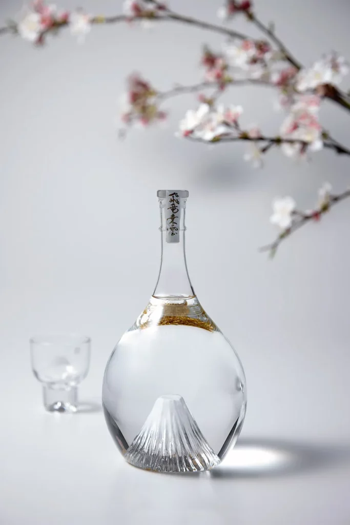
Then there is the Mt Fuji Hiryujoun bottle. The design highlights the famous Japanese volcano and the famous gold leaves give a snow globe appearance to this incredible bottle. When purchasing, you can have the bottle engraved and there is a box with LEDs on which you can place the bottle in order to make the most of the color experience throughout the seasons (the colors are reminiscent of spring, summer, winter and fall). It’s like having the opportunity to visualize Hokusai’s 36 views of Mount Fuji at home! The bottle is supplied in a wooden box on which the famous calligrapher Takeda Soun has designated the name in ideogram. The box is placed in a furoshiki (a fabric) to finalize the experience and to accentuate the fact that it is a unique gift that we give (to ourselves).
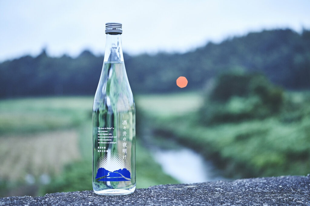
Let’s not forget, Saké Nouveau: “The Dawn in Shisui”, which is produced by Maison Iinuma Honke in Chiba. This is a conceptual project which takes up the idea of the first extraction, the first “hatsu shibori” press which takes place in November. It is therefore the idea of enjoying this new sake, the first born which comes to life at midnight and which is bottled directly afterwards. This is the reason why this Saké Nouveau (inspired by Beaujolais Nouveau) is called Aube à Shisui. I love this transparency and the label-free simplicity of this bottle.
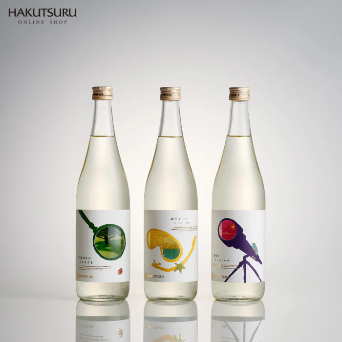
In a different but super nice style, I discovered the House Hakutsuru ‘s atypical sakes. This kura is very well known but I had never seen their Bekkaku range with 3 sakes to see the world of nihonshu in a different way. The front label is pierced and you can see a drawing, a landscape through this window which is actually at the bottom of the bottle. These sakes were created for the younger generation and represent moments of tasting: on a sunny afternoon, you are in the shade of a tree and you enjoy Komorebi no Mushimegane sake; at the seaside under the blazing sun, you take advantage of this day to create memories with Hidamari no Snorkel; the sky is purple like bunches of grapes and we raise our glass to the first star that we vaguely see with Tasogare no Telescope! It is again the graphic designer Aya Kodama who is behind these beautiful bottles with the illustrator Miku Sasaki. All 3 bottles won the 2021 Good Design Award.
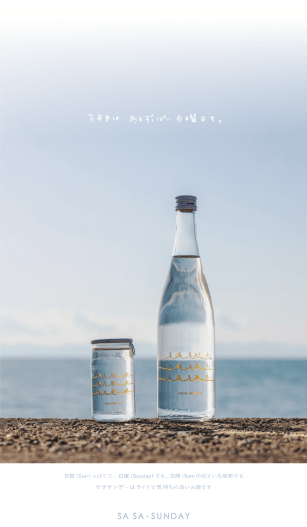
Finally, here is another bottle that I love for its simplicity: Sa Sa Sunday from Maison Sasawai Shuzo. There are little plays on words between SAN (acid), SUN (sun) and SUNDAY (Sunday): it is therefore a tangy and fresh sake for a sunny Sunday. It is made with the famous Kamenoo rice and the design is made for young consumers. Yuri Ueno designed the design and she is a (very) young woman in her twenties. It’s simple and effective with these little golden waves…
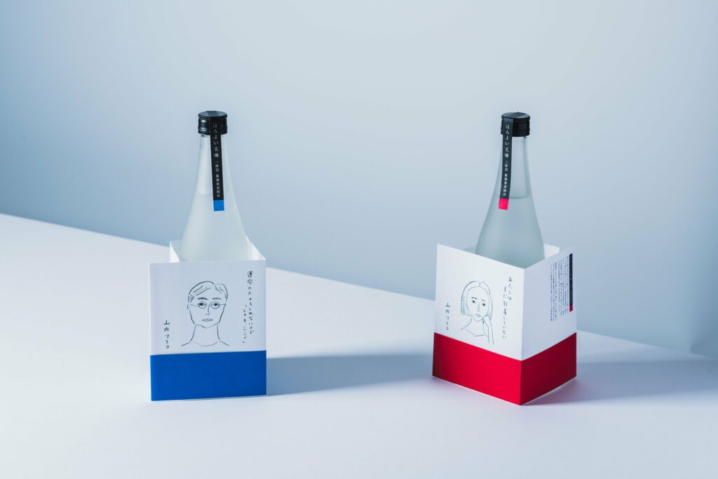
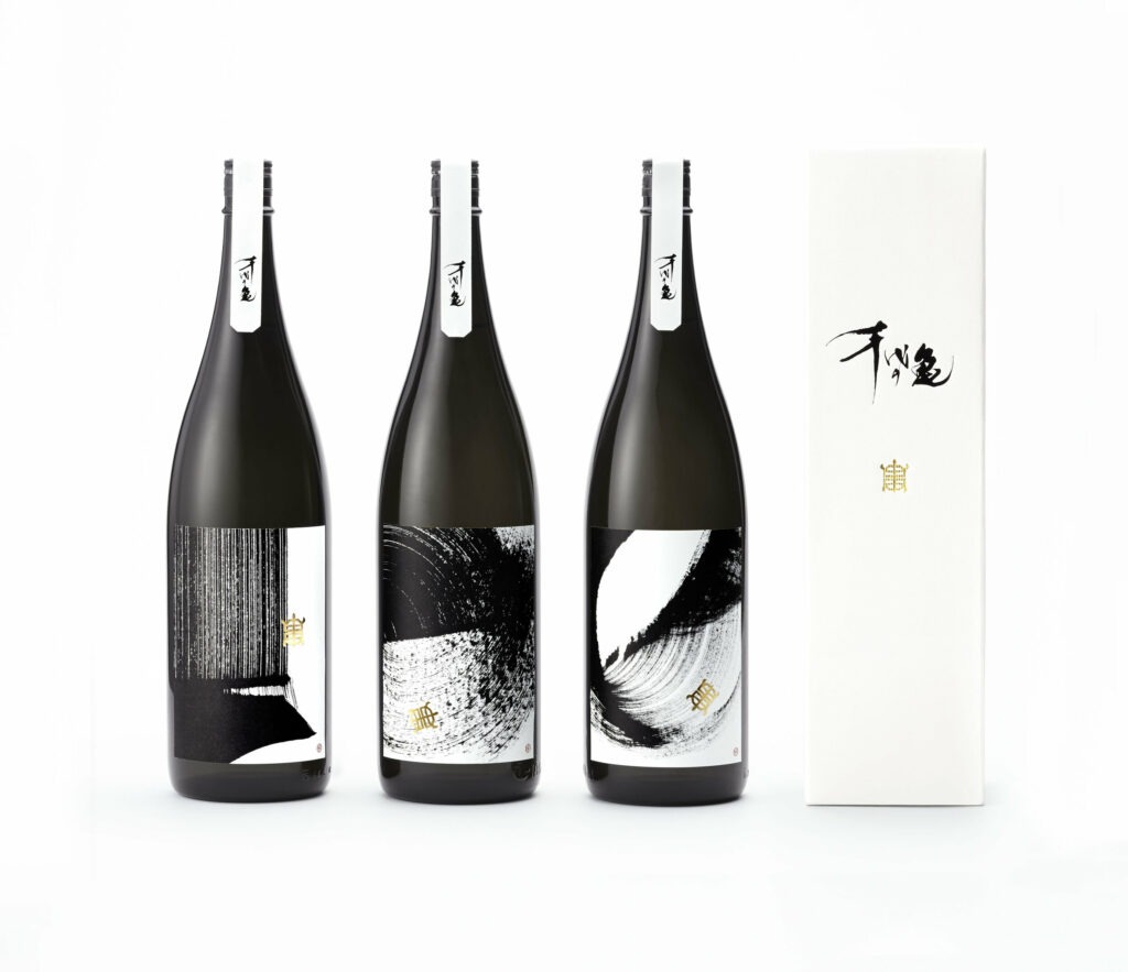
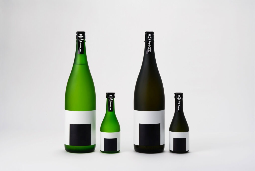
There are other packaging that I love… There is so much creativity in the world of nihonshu! So I’m offering you some samples in May 2024 but I think we should do an article every month because there are always new ultra cool products!
#France Bleu Gironde broadcast from May 14, 2024 with Marie-Corine Cailleteau: click on the link to listen to the replay more easily and go to my Instagram @chloeandwines to see my appearance on the radio in Reels!